

A Case Study in Brand Strategy from the Forest to the Family
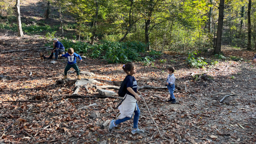
Every brand has a story. For “Yolochka,” a forest school for families, the story was powerful: a joyful adventure in nature. But the challenge was complex. The founders knew parents wanted their children to be confident and free, but they also knew many were held back by fears of dirt, risk, and the unknown. Our task was clear: design a brand identity that didn’t just sell a product, but also sold trust. We needed to be both adventurous and safe. As the founder of your business, you may face a similar challenge: “How to make a premium, sustainable product feel accessible and trustworthy?” Here’s how we did it in Blue Lion.
The Solution: A Strategic Blend of Joy and Security
We began with the name “Yolochka,” the diminutive for a spruce tree in Russian, which carried immediate symbolic power. It’s the tree of family joy and healing, a subtle yet powerful signal that this brand is rooted in wellbeing.
From there, every design choice was a strategic step toward building a bridge of trust.
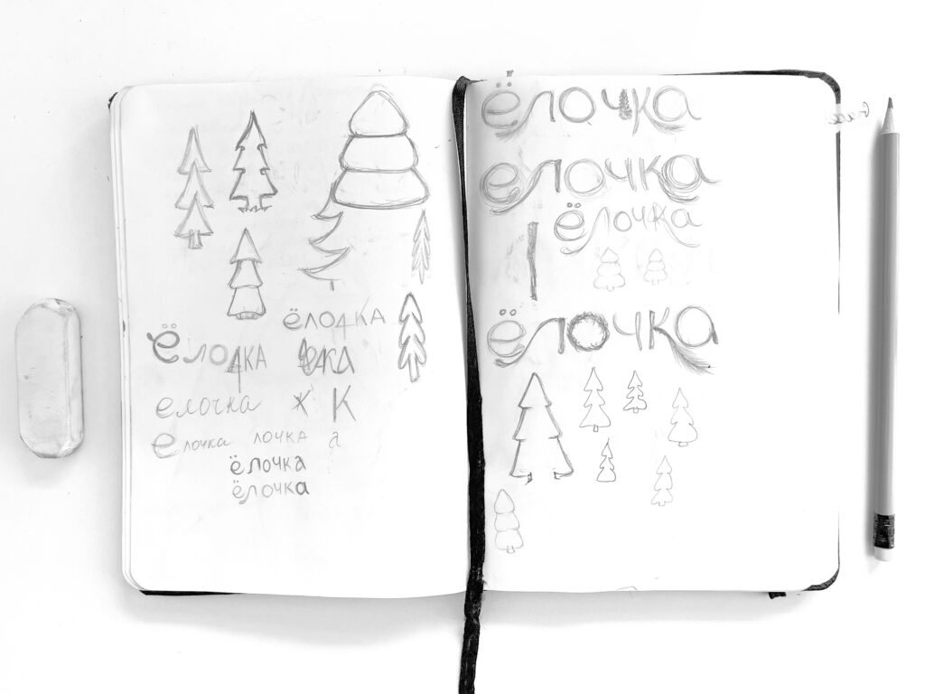
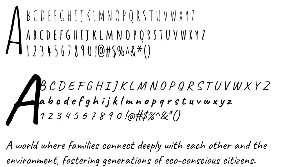
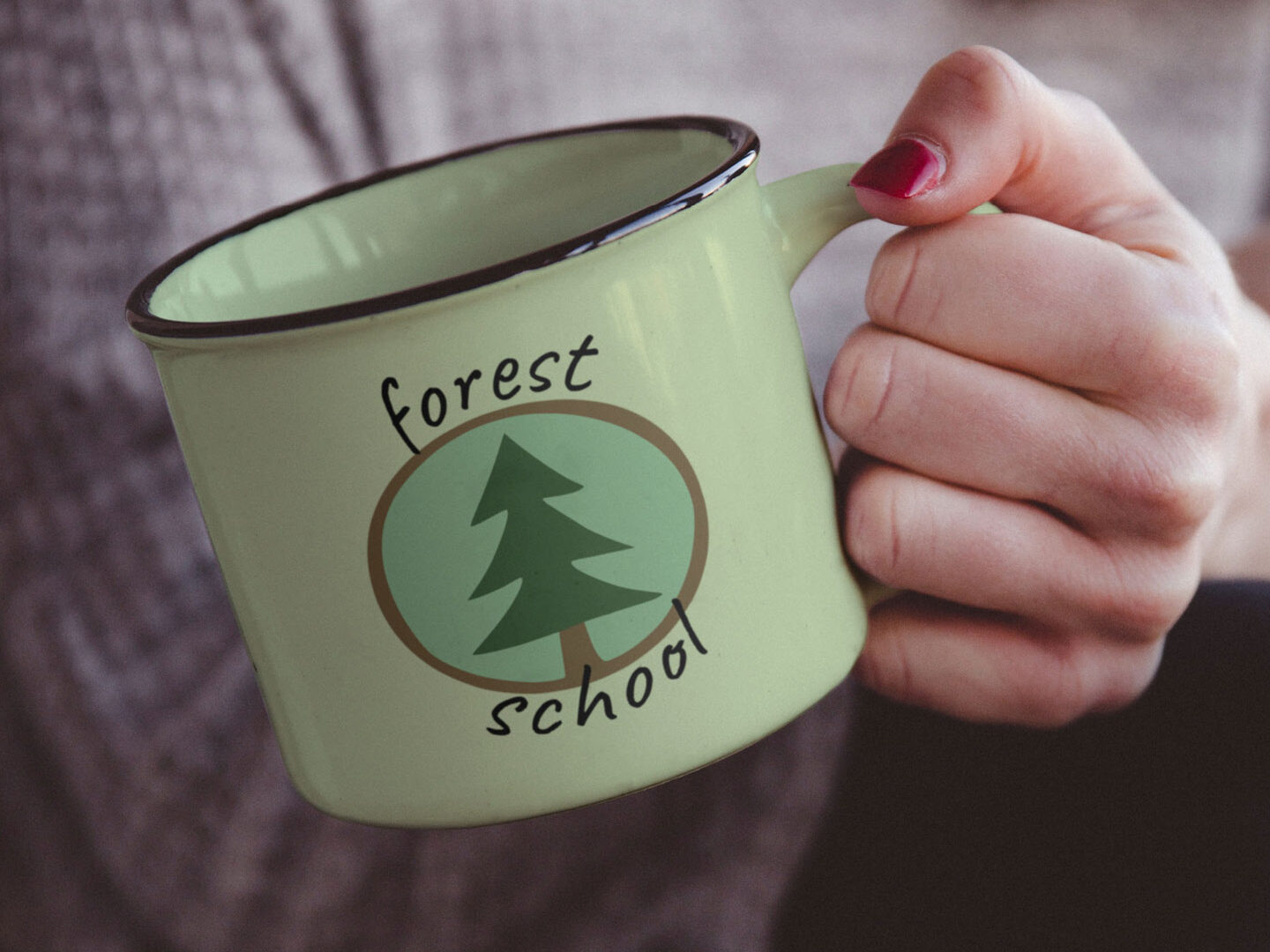
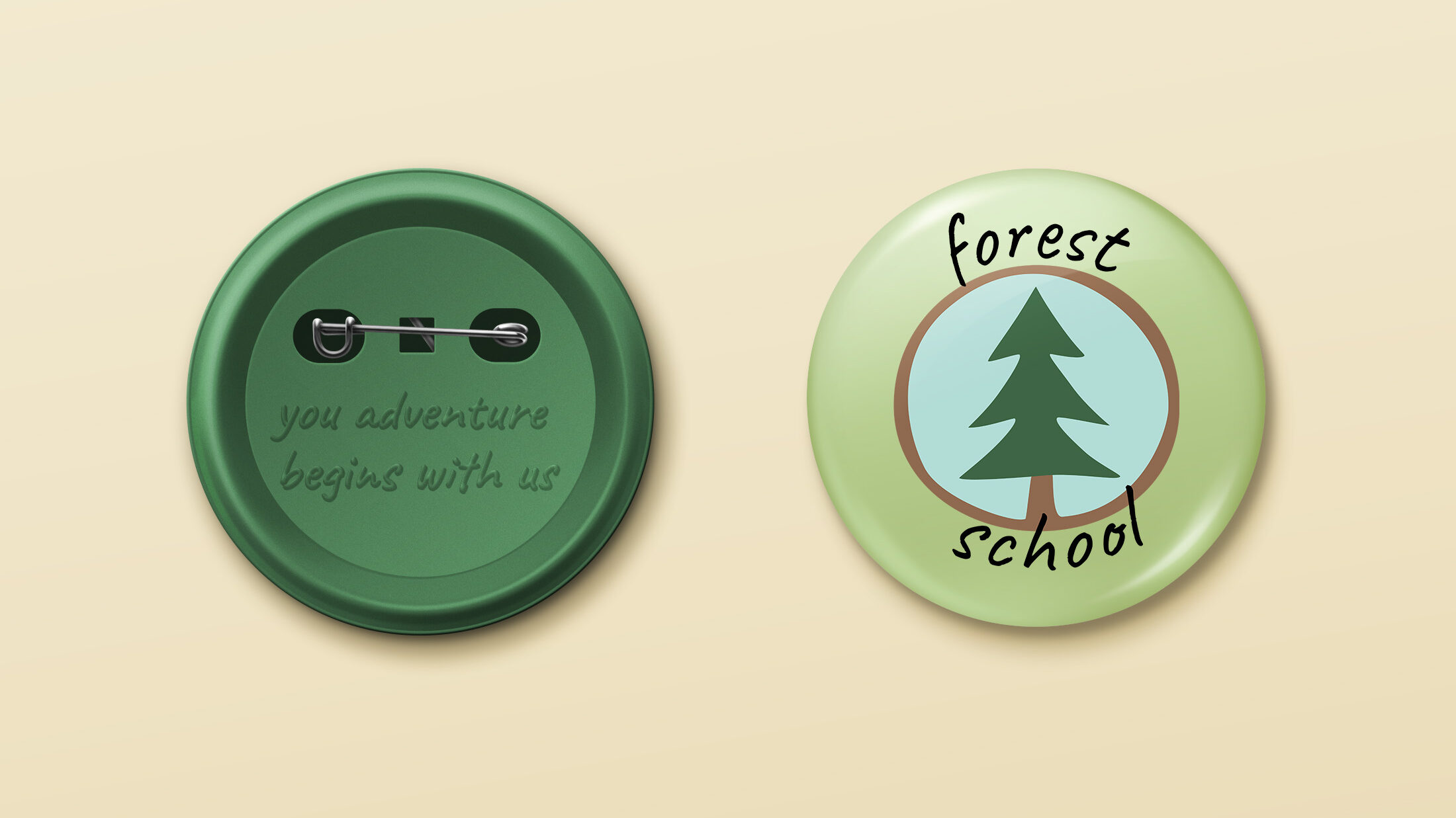
- The Power of a Gentle Hand: Our hand-drawn logotype and logomark were essential to this. The imperfect, natural lines of the spruce tree symbol and the flowing script of the name were purposefully created to feel soft yet incredibly trustworthy. This design choice communicates that every aspect of the Yolochka service—from the carefully planned walks to the mindful guidance—is thought through and made with hands and heart. It’s a visual promise of a genuine, personal experience.
We chose hand-drawn fonts like Amatic and Caveat. For our client’s customer, these fonts aren’t just a design trend; they’re a visual handshake. They convey authenticity and a gentle, human touch, reinforcing the brand’s natural and organic feel. This is a crucial element for a brand selling things that people consume like yours. It feels real, not sterile or corporate.
- Colour as an Emotional Compass: We moved beyond a generic “eco-green.” The chosen palette—with its earthy greens, warm blues, and rich browns—was selected to evoke a sense of calm, safety, and groundedness. The addition of joyful, yet settled, yellows and oranges brought in the dynamic energy of play without feeling jarring or artificial. For a consumer considering a walk in a wild forest, these colours subconsciously say: “You can trust this.”
The Outcome: A Brand that Converts
The final identity for “Yolochka” was more than a logo and a colour scheme; it was a complete brand system that told a story and built a community. This holistic approach extended to the web design, ensuring a seamless experience.
For more detailed insights into this project, visit the full case study on our website.
What Your Brand Can Learn from a Forest School
The principles of authentic, values-driven branding are universal. The “Yolochka” project holds valuable lessons for any business built on trust and integrity. We know that you care about your customers, the environment and how we all impact on each other. Then consider these takeaways for your own brand:
- Your Brand’s Name is Your First Story: “Yolochka” was more than a label; it was a symbol of healing and joy. Does your brand’s name immediately convey its core value? Is it simply descriptive, or does it tell a story that resonates on an emotional level?
- Every Visual Element is a Promise: The hand-drawn fonts and soft colour palette were a promise of authenticity and safety. When a customer picks up your product, does the packaging and logo instinctively communicate the purity and care that went into it? Are you using colours that evoke trust, or are you just following a trend?
Need a quick review of your colour palette? Contact us to begin your transformations toward greatness!
Turn Your Values into a Visual Reality
The final identity for “Yolochka” was more than a logo and a colour scheme; it was a complete brand system that told a story and built a community. This is the kind of holistic, strategic design that Blue Lion brings to every project. We don’t just make things look pretty. We collaborate closely with our clients to understand the unspoken anxieties and desires of their customers.
Ready to infuse your sustainable mission into a brand that truly connects?
Contact us today, and we will help you find the most suitable and natural way to integrate your values with the visual identity of your dreams.
Leave a Reply