
Bright UP!
Full brand design for a social cause project on youth alienation
BrightUp is a self-initiated, research-driven project developed by a multidisciplinary group in collaboration with Chiara Calvo. The project addresses the growing social issue of youth alienation. From the beginning, our goal went beyond visual identity design. Instead, we focused on shaping the entire project, including its structure, tools, and interactions.
First, we based every decision on research and real human needs. Then, through in-depth analysis and close collaboration, we explored different ways to support teenagers. As a result, we designed a solution that offers a safe and supportive space. Here, young people can connect, express themselves, and feel understood.
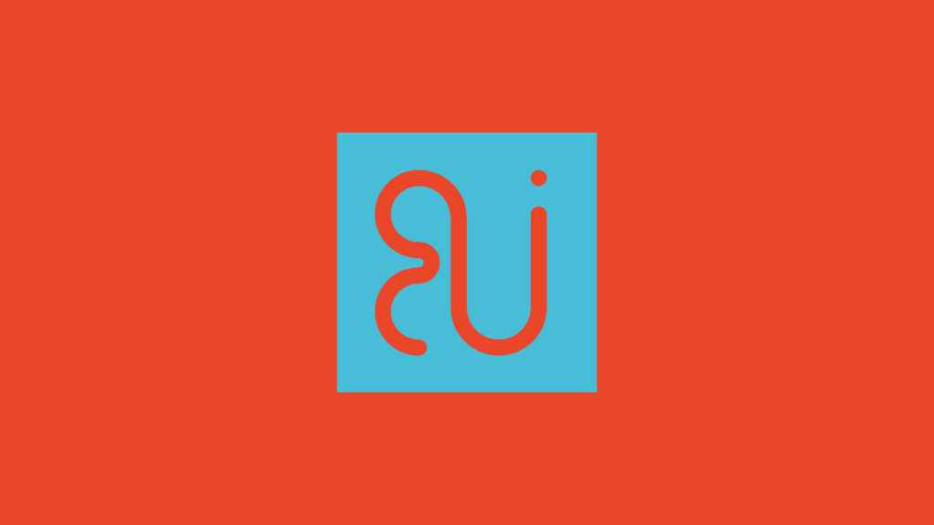
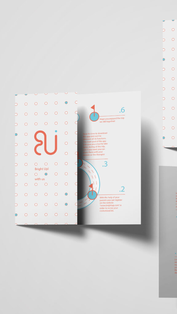
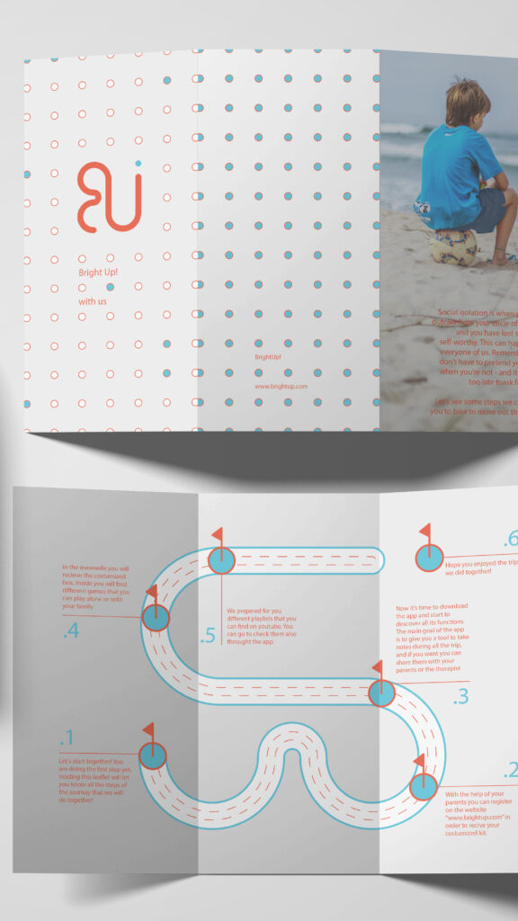
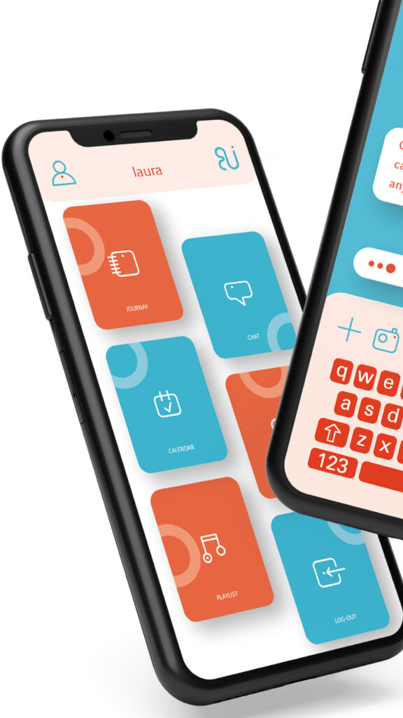
The visual identity was designed to communicate hope, safety, and gentleness. We selected a joyful yet secure palette of blue and orange to evoke trust and optimism, offering teenagers a sense of reassurance and the possibility of resolution. The logotype was created using the Praxis Next typeface, chosen for its contemporary clarity and approachability. Soft curves were introduced into the logomark to express care and emotional safety, while the symbol itself represents a road — a journey toward a better place. BrightUp responds to the problem of alienation by offering direction, connection, and the quiet confidence that change is possible.
no one shall battle alone
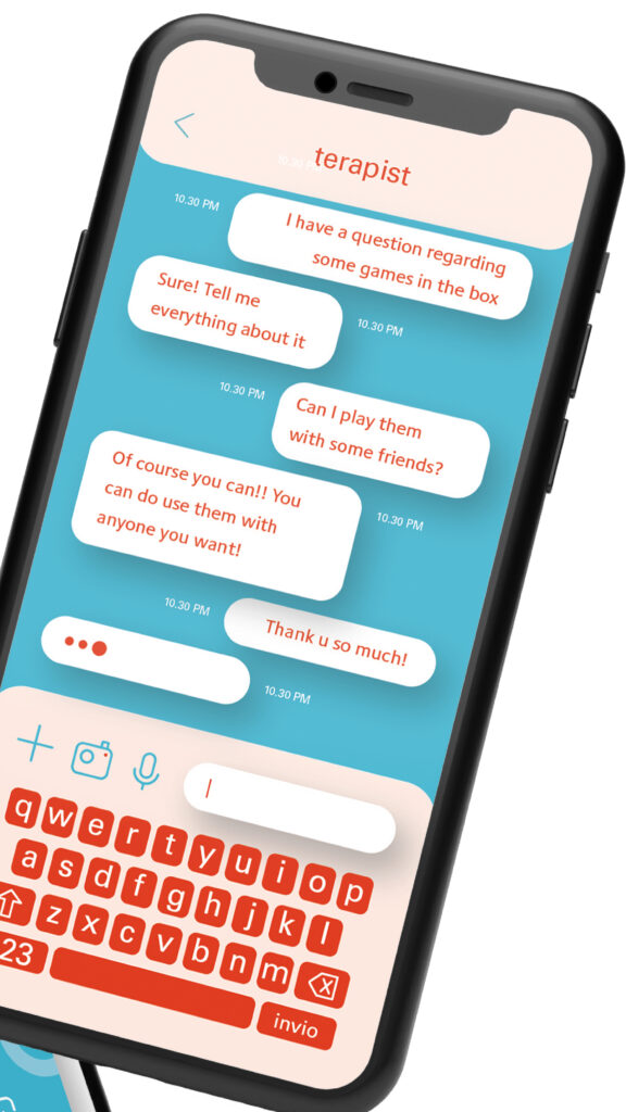
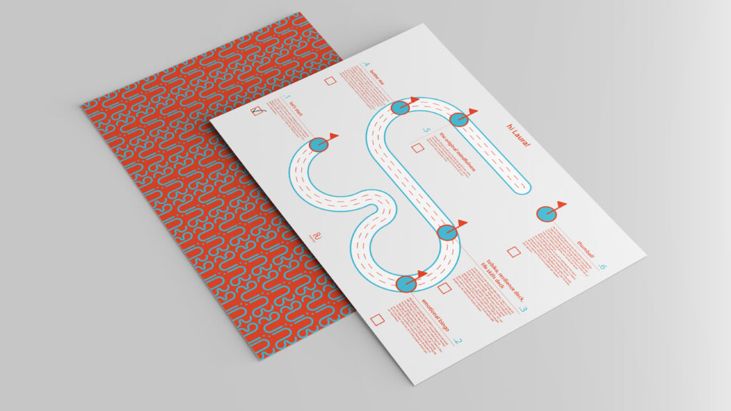
Our process combined strategic design with careful, responsible choices. We curated and tested games that encourage interaction without pressure, prototyped a mobile app to explore accessibility and engagement, and, in collaboration with a music therapist Anna Kareva, designed playlists intended to support teenagers through different emotional states. To make these resources easily accessible, we also created a dedicated YouTube channel featuring carefully selected playlists aligned with the project’s emotional and developmental goals. Alongside the digital experience, we developed a guide for adults — parents, educators, and mentors — detailing how the system works and how it can be used thoughtfully and effectively.


BBrush
Identity design for a bamboo toothbrush.