
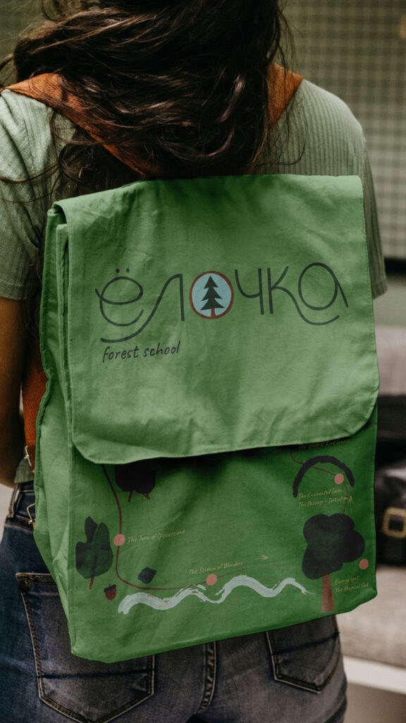
Yolochka forest school
Full brand design, identity and landing design for Multilingual Forest School in Milan.
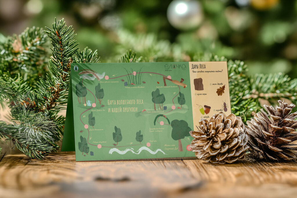
Yolochka is a forest school in Milan where learning begins in nature and grows through shared experiences. We built the brand’s look around the fir tree. This tree is a powerful, feminine symbol in many cultures. It represents the Earth’s energy, warmth, and the feeling of togetherness we get when we gather around it, like on Christmas Eve. This natural symbol became the anchor of the brand. Therefore, we then turned the school’s core values—adventure, exploration, and love for nature—into a visual style that feels organic, safe, and inspiring.
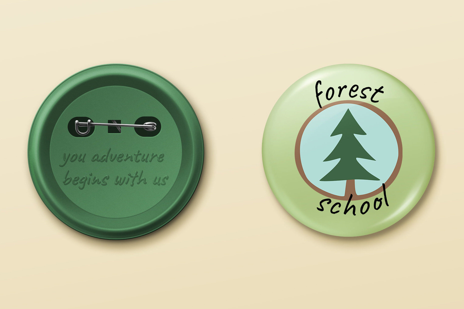
To emphasise the warm, family-focused atmosphere, we created a hand-drawn logo that looks like it was carved into wood. Moreover, we chose the fonts Amatic and Caveat for their friendly, handwritten look. Also, they reinforce the idea of playful discovery and real connections. In this way, every detail of the brand—from colours to illustrations—celebrates Yolochka’s vision. This vision is about nurturing curiosity, strengthening family bonds, and building a lasting relationship between people and the natural world.

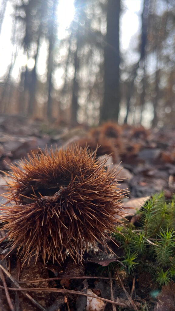


There is always something new to discover.
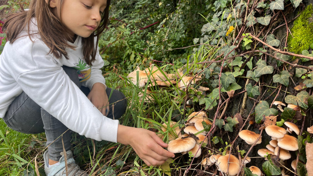
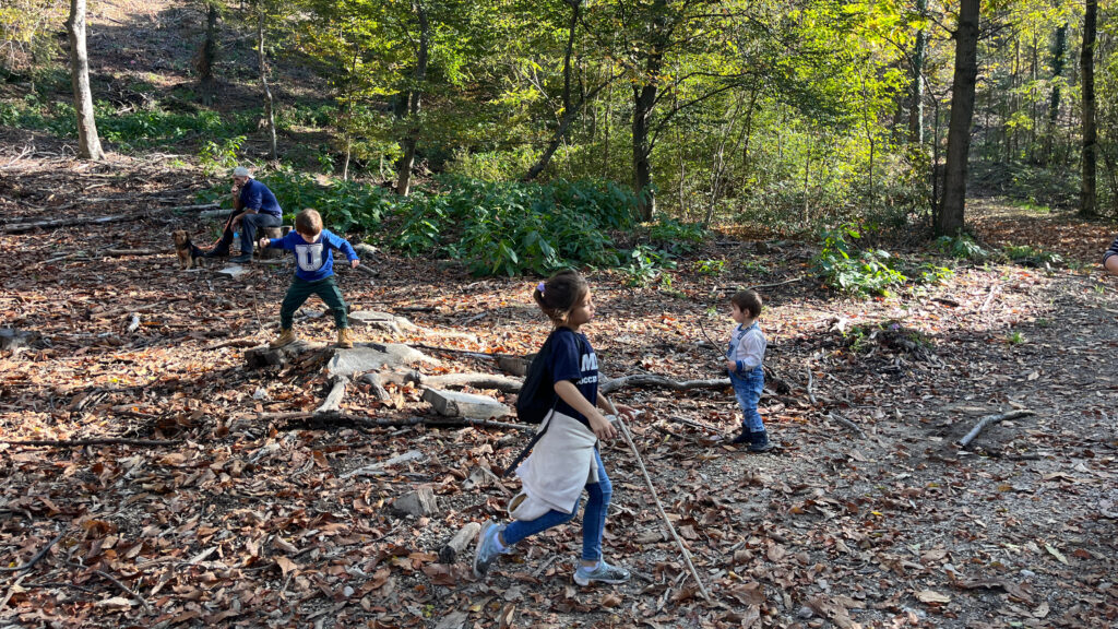
Family bonding is a main objective of this school. Kids and parents experience the amazing world of nature together, building strong relationships based on trust, understanding, support and love.


London Sewing Courses